
Archivo: 1851-2017 Atlantic hurricanes and tropical storms by month

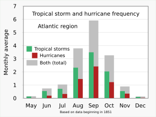
Descripción: Graph of tropical storm and hurricane frequency, Atlantic region, monthly, based on data from 1851-2017. SVG version uploaded 2021-04-12.Data source: Landsea, Chris (contributor from the NHC). Total and Average Number of Tropical Cylones by Month (1851-2017). aoml.noaa.gov. National Oceanic and Atmospheric Administration, Atlantic Oceanographic and Meteorological Laboratory. Archived from the original on September 1, 2018.Raw data (not all columns from spreadsheet were used in uploaded graph): Month Total TS Tropical Storms Total Hurr Hurricanes U.S. Landfall Hurricanes U.S. Landfall Hurricanes Both (total) Jan 3 0.02 2 0.01 0 * 0.03 Feb 1 0.01 0 0.00 0 * 0.01 Mar 1 0.01 1 0.01 0 * 0.01 Apr 2 0.01 0 0.00 0 * 0.01 May 22 0.13 4 0.02 0 * 0.16 Jun 92 0.55 33 0.20 19 0.12 0.75 Jul 120 0.72 55 0.33 25 0.15 1.05 Aug 389 2.33 245 1.47 80 0.48 3.80 Sep 584 3.50 404 2.42 111 0.67 5.92 Oct 341 2.04 205 1.23 54 0.33 3.27 Nov 91 0.54 59 0.35 5 0.03 0.90 Dec 17 0.10 6 0.04 0 * 0.14 Almost all the XML code for Version 1 was automatically generated by the "Column graphs" spreadsheet linked below. Positioning of titles and legends was done manually inside the .svg text file. General concept above; examples below. .mw-parser-output .tmulti .thumbinner{display:flex;flex-direction:column}.mw-parser-output .tmulti .trow{display:flex;flex-direction:row;clear:left;flex-wrap:wrap;width:100%;box-sizing:border-box}.mw-parser-output .tmulti .tsingle{margin:1px;float:left}.mw-parser-output .tmulti .theader{clear:both;font-weight:bold;text-align:center;align-self:center;background-color:transparent;width:100%}.mw-parser-output .tmulti .thumbcaption{background-color:transparent}.mw-parser-output .tmulti .text-align-left{text-align:left}.mw-parser-output .tmulti .text-align-right{text-align:right}.mw-parser-output .tmulti .text-align-center{text-align:center}@media all and (max-width:720px){.mw-parser-output .tmulti .thumbinner{width:100%!important;box-sizing:border-box;max-width:none!important;align-items:center}.mw-parser-output .tmulti .trow{justify-content:center}.mw-parser-output .tmulti .tsingle{float:none!important;max-width:100%!important;box-sizing:border-box;align-items:center}.mw-parser-output .tmulti .trow>.thumbcaption{text-align:center}}Warming stripes (composite)Warming stripes bar chart Bar chart (vertical)Pie chart Line chartsScatterplot I've uploaded .xlsx (Microsoft Excel) spreadsheets that automatically generate XML code for charts in SVG format. You simply paste or enter your data into the spreadsheet, and specify image dimensions, number of grid lines, font sizes, etc. The spreadsheet instantly and automatically generates a column of XML code that you simply copy and paste into a text editor and save as an ".svg" file. The spreadsheets produce lean SVG code, avoiding the "extra stuff" that Inkscape inserts. They should save you time in creating SVG charts. Feedback and suggestions on my talk page are welcome. RCraig09 (discusión) 23:41, 19 February 2021 (UTC) Click HOW TO for detailed explanation. Click HERE to download spreadsheets. Example SVG files: Category:SVG diagrams created with spreadsheet. Warming stripes — Accepts a single dataset and converts to SVG code portraying Ed Hawkins' warming stripes graphics. User chooses vertical or horizontal stripes; normal or reverse data ordering; or from a variety of geometric shapes (updated 4 June 2021). . . . . Click here to see examples of warming stripes embedded in different shapes. Warming stripes bar chart — Accepts a single dataset and creates a conventional bar chart whose individual bars/columns are coloured according to Dr. Hawkins' warming stripes colour scheme. Alternate option: choose one colour for ascending bars and another colour for descending bars. (updated 27 Jan 2022) Line charts — Accepts up to five datasets. (updated 25 Jan 2022) Vertical bar charts (column charts) — Accepts up to six datasets. Toggle between clustered and stacked charts; user can adjust "Yfloor"—the Y level (usually=0) from which columns rise or fall; user chooses to keep or ignore negative input values. (updated 14 May 2022) Horizontal bar charts — Accepts up to six datasets. Toggle between clustered and stacked charts; user can adjust "Yfloor"—the value (usually=0) from which bars extend; user chooses to keep or ignore negative input values. (updated 27 Jan 2022) Scatter plots — Accepts up to five datasets. (updated 25 Jan 2022) Pie charts — Accepts a single dataset of up to 36 items. (updated 7 Oct 2022)
Título: 1851-2017 Atlantic hurricanes and tropical storms by month
Créditos: Trabajo propio
Autor(a): RCraig09
Términos de Uso: Creative Commons Attribution-Share Alike 4.0
Licencia: CC BY-SA 4.0
Enlace de Licencia: https://creativecommons.org/licenses/by-sa/4.0
¿Se exige la atribución?: Sí
Usos del archivo
La siguiente página enlaza a este archivo:
